Tuesday 20 February 2024

Final Piece

 This blogpost contains the final piece which includes the following music video, social media, and digipak

Music Video:


In case of copyright issues here is an alternative link

https://drive.google.com/file/d/1FMF4PhOGDXxS1GuUSOiGiDVEW7ahaSVs/view


Digipak:


Social Media:


Critical Self Reflection

 Down below is my critical self relfection that consist of 1112 words

Cambridge gave a variety of briefs that i could do, I chose to make a music video brief because it really fits to be a

final project and gives me lots of experience in fact it will also be the biggest and most time consuming project that I take. I decided to chose the genre romance and indie because nowadays lots and lots of people are experiencing romance especially teens nowadays at the age of 16-20 with this genre it will really make a good connection with them cause they can relate to this music video.


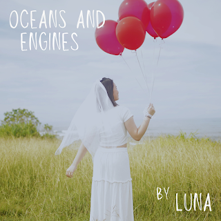
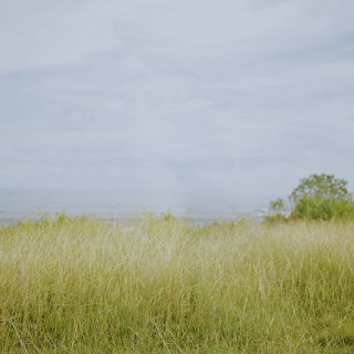
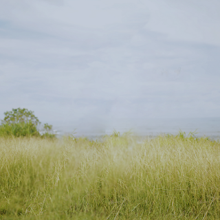
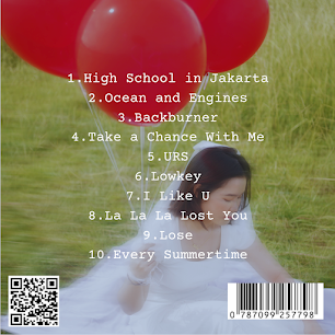
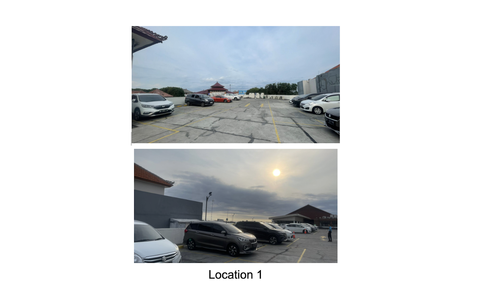
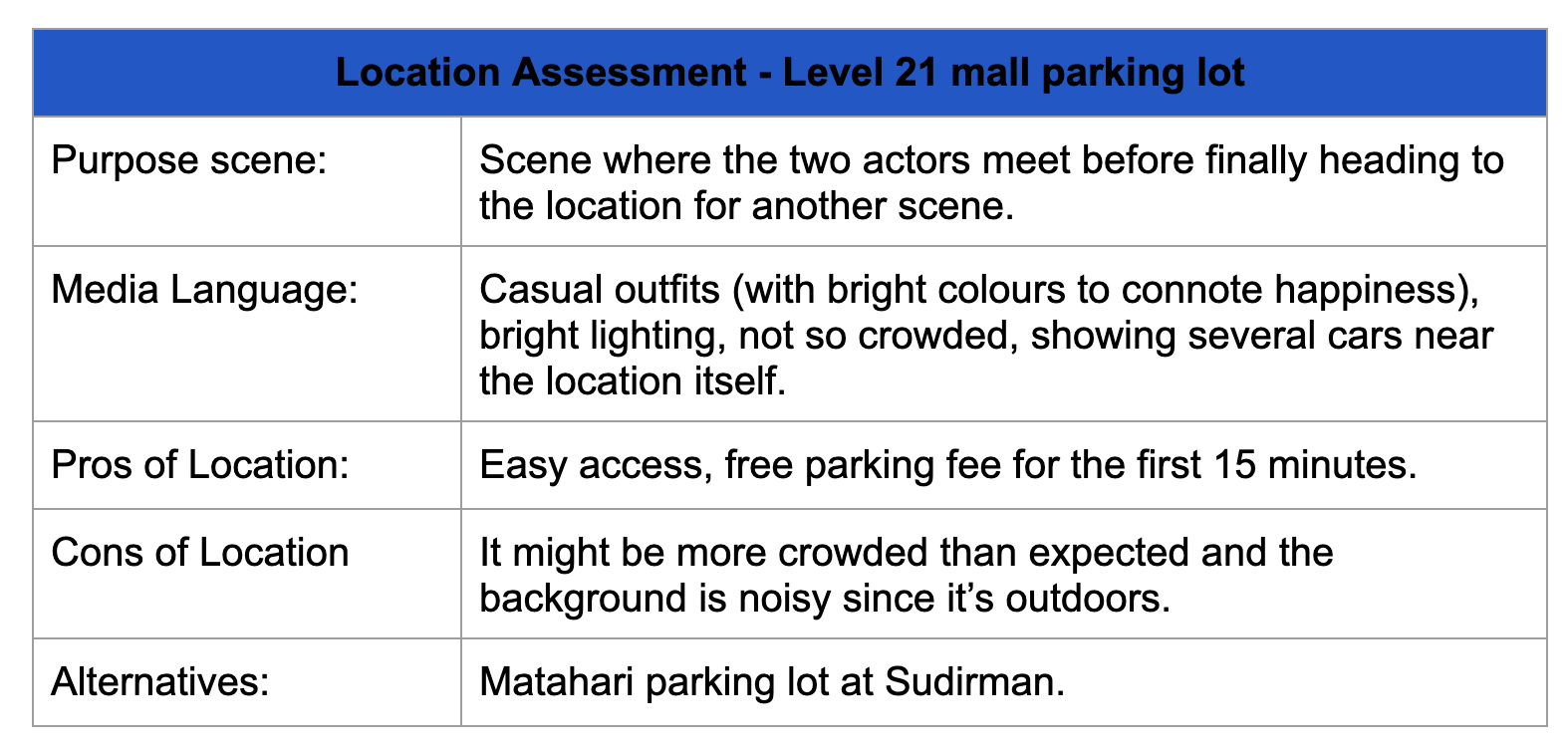
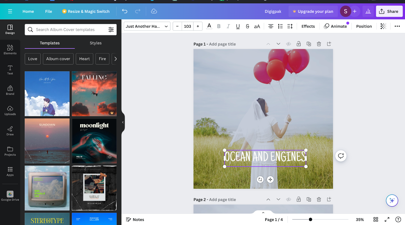
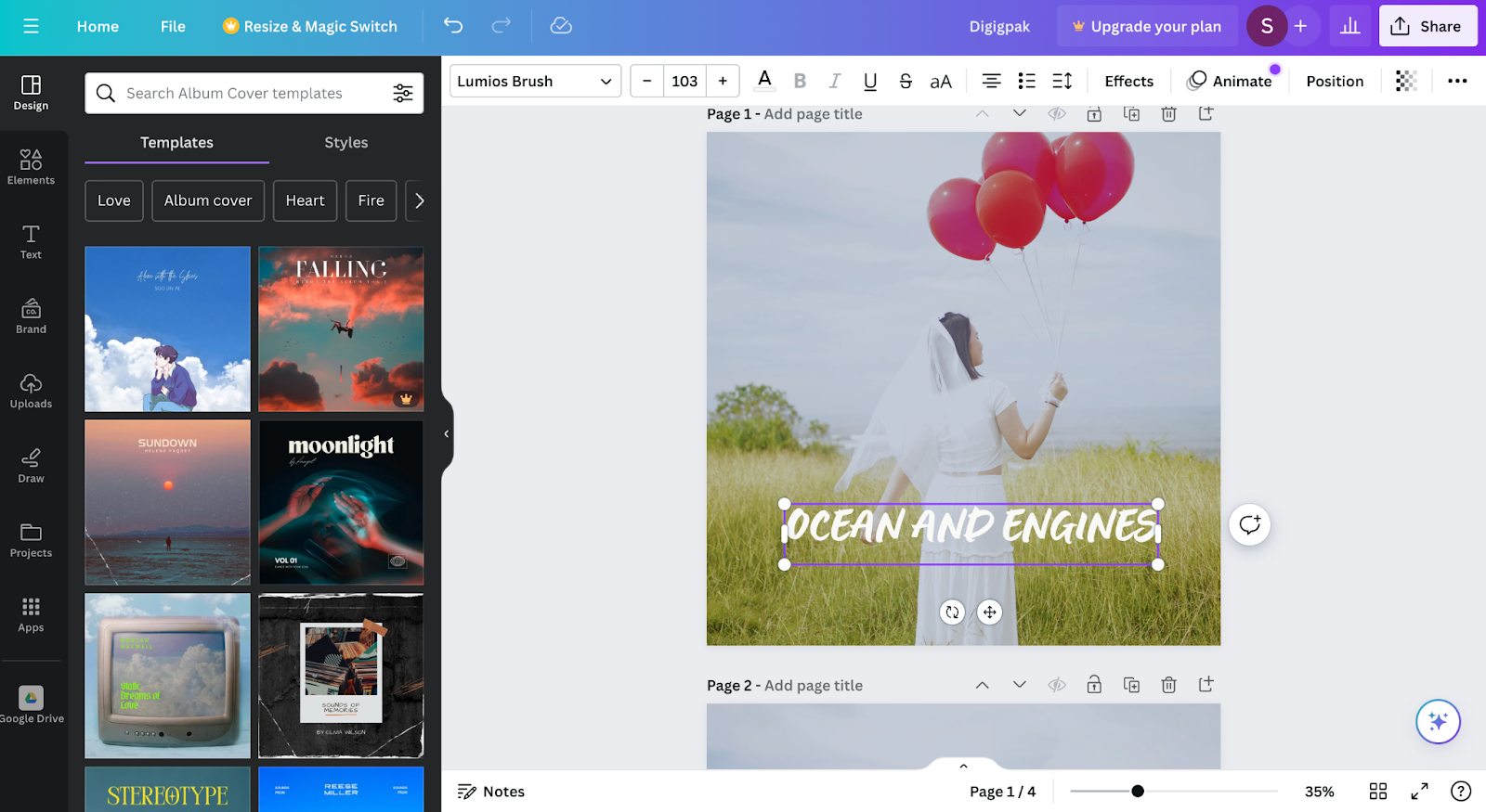
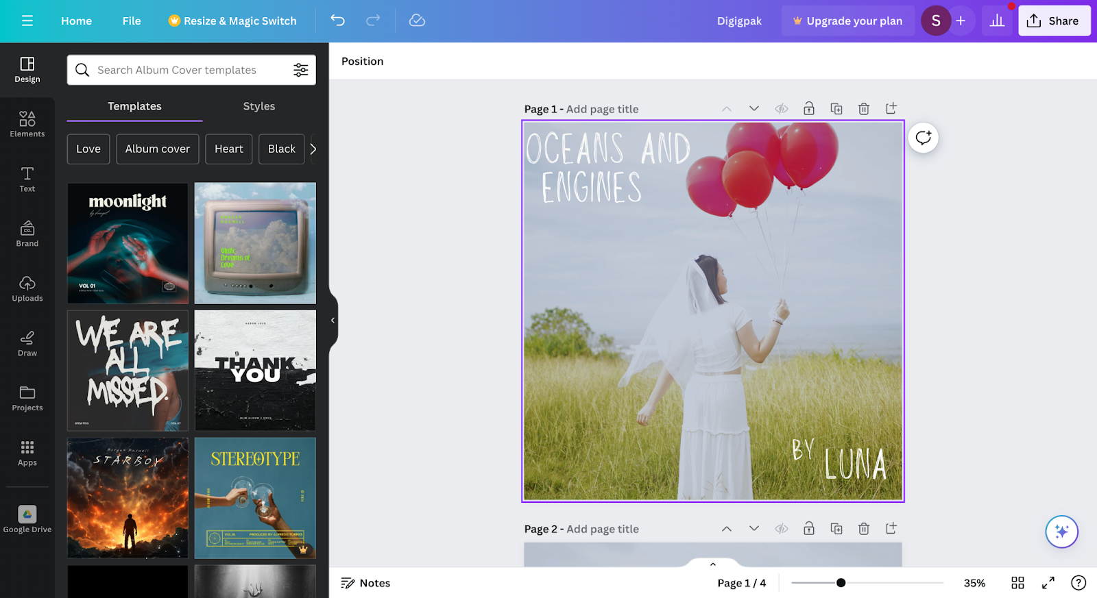
This project will start off by choosing the song for our music video I decided to to give my opinion to my team to choose Ocean and Engines as a song, because it is a very well known song and popular song everybody knows the song especially those who are in the tennagers age range. Other reasons are this song based on the title “Ocean” which means there will be oceans in the music video scene and it will be very easy to find ocean here with variety of different options secondly the word “Engines” will more relate to a vehicle to be specific cars.

This song personally I believe is a sad, heartbreaking, and sympathetic song due to the lyrics that are really touching and creates connotations. The genre convection of this music video is romance. To start of the scene of our music video there will be a girl name Luna, flashback of her and her boyfriend will start off the music video by showing the peak of their relationship where everything is very fine they both love each other at the highest state and doesn’t have any problems with one another. During this scene filters were added to like a gloomy and dreamy effect to create connotations with the audience that this is the past in a dream. As she wake up from her dream she realize that it was all just her dream her boyfriend is already gone non existence and nowhere to be found. When she woke up the filter was removed to connote that its her reality now not a dream anymore. There is a scene where she started to sleep inside the car when she is sleeping the camera move slowly towards her to make a connotation of bringing the audience with her and when she wakes up the camera will zoom out of her to bring the audience away. The final lyric “My great lost love” is a very sympathetic lyric with lots of connotation, in this case we can connote that this lyric shows that her boyfriend is long gone and far away from existence, this lyrics we came up with an idea to use a polaroid picture by throwing it outside the car. This will create a connotation that her boyfriend is already gone. To finalize my music video are really aiming towards tennagers especially those who are in a breakup state. We also want to tell that relationships can sometime be good and can sometime be bad.


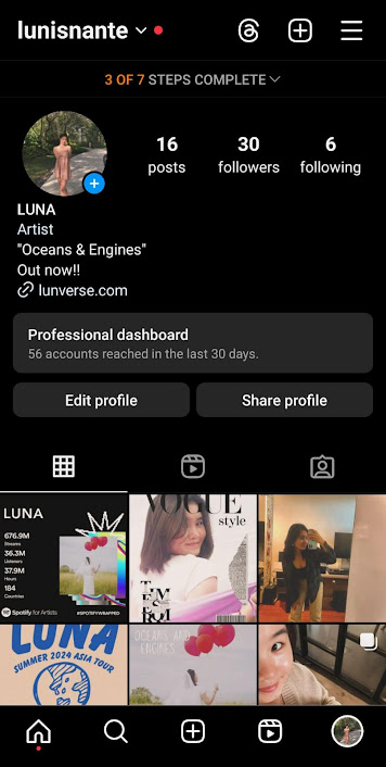
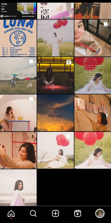
Branding is way in which a product is going to be presented to the audience and will increase the awareness of the product through various different ways. Our music video will be represented in different ways which are social media and digipak. Both digipak and social media need to share the same mood and vibe, for ours we decided to make it more into a passive feeling which leads more towards sadness. We want to make as mush connection as we can through both the social media and digipak based on the music video in this case the music video will have a sad and heartbreaking theme the social media post will also follow through it. The font used on the digipak and social media are both the same font used to match each one another. In the end we decided to change the concept of the social media from posting aesthetic photos in order with neat concept into a casual concept which means that the picture that will be posted in the social media are casual picture of her in her daily life showing her activity, with this is will bring and engage more of the audience with her. With this the audience can see or can feel like Luna is their friend not like a star who only post information about their tour and song while Luna she posts picture of her outfit of the day for example and her daily life activities.


The product will engage the audience through various different types of platforms options are youtube, instagram, and tiktok. Youtube is the most popular and well known platforms when a star or a celebrity uploads their music video into a social media platform youtube being the number one choice for them due to the popularity and youtube will also provide algorithm for the users to match their music taste. To add they will also have a global span of range for the algorithm while Instagram mostly will only have a span in one category or platform. On the other hand by time goes by Tiktok has become a very well known app and very popular for those who are trying to promote their product especially through short videos. Nowadays Tiktok has a huge global user and will make it easier to reach more audience, that is why nowadays most artist and star uses Tiktok to promote their product in short video, Tiktok can also create and algorithm for us called “fyp” also known as for you page with this it will be easier to get awareness from audience.

To create this project I did lots of research through different celebrities and star to give a key concept and idea of our music video in the future. The research that are done are through star who has a similar vibe with our star Luna. With the research of different star it can help us to create our social media page and digipak in the future to have a similar vibe with the song and Luna itself. The original star name of this music video is NIKI we decided to use Luna for our star name after going through some research we want to keep the name as simple as the original creator of this song and music video. The word Luna itself means moon which matches the vibe of calm and friendly like NIKI the original artist. At the end me and my team decided to create a music video that really relates a majority of teenagers now days by break up and sad theme


Thursday 8 February 2024

Post Production

Down below this blogpost will contain editing process of the music video after the shooting. It will also explain what elements are use in order to create the final product, to add it will also give information about the software we use. This blog post was made by my friend Theo

Reflection: This blogpost really helped me out to know what elements are used in the music video and how e used and apply them in certain scenes of the music video, and beside that we also use this to create the music video title.

1. Colour Grading

Colour grading is the most essential part of the music video editing where I wanted to make sure where the music video is likely to be visual appealing and spoil the audience. Colour Grading also important in driving the mood and the tone of the music video. 


2. Glowing Dreamy Effect

This is done by copying the layer below into the top and putting the Gausian blur effect on top and put luma key in other to get the glowing blooming effect. 


3. Music Video Title


4. Stabilizing
Since some scenes were quite shaky I need to edit the scenes to be more stable. I do this by doing some masking on the subject since the effect I used is wrap stabilizer. The masking is important for making sure the subject is not jellying.

5. Slow Motion effect
I do this by slowing down the speed 

6. Key frame

I used keyframe technique to make the zoom in effect or zoom our effect


Wednesday 7 February 2024

Risk Assesment

 This blogpost below will show the locations that we plan to use including the risk and also terms and conditions. This was done by the three of us which include Me, Theo, and Nadine.

Reflection: This blogpost help me by knowing what will happen in that location and can also ready be planned to prevent a worst outcome. By having a list of pros and cons in each location we can make a comparison between locations we want to choose and can be prepared when recording there to make it easier.

Tuesday 6 February 2024

Digipak Research

This blogpost contains research and development of the digipak to add it will also explain why we chose this option and design rather than the others.


The images above are comparison between 2 same pictures with different filters the first picture above has a darker filter to make the image warmer by adding a slight blue filter on the other hand the second picture uses a bright filter to make everything look shiny. At the end I decided to use the first picture to as the front digipak cover, because with the warmer color it connotes more to the song which in this case have the song have a sad vibe. The warmer color fits more in the digipak due to the warmth it has and a darker brightness. Beside that it also easier to fit a font color on the first option, because it is not to bright while the second option the color is way to bright which may cause difficulties to read the caption.

These two image above are comparison of fonts that we might use for our digipak album cover. The first picture has a font that is called "Just Another Hand" this font has a simple and compact design compare to the second picture with "Lumios Brush" font it has a more complex design and to add the first font its easier to read rather than the font in the second picture. We chose "Just Another Hand" for our 

In the middle of the timeline I decided to change our font into Louiseville ll, I change to this font instead of the previous font because its is fit better to the background of the digipak and it also has a connotation that this font is handwritten by Luna. We the handwritten design of the font gives the vibe a bit more calming rather than the other are more leanign towards AI generated font, I want to make this digipak look like Luna's is creating it from scratch by herself with her own hand writing.

To finalise the design of the digipak i decided to use the Lousieville ll font to use for the final product of the digipak.

Down below are more research of digipak from other star and celebrities. This was created by Nadine

BLACKPINK


BLACKPINK's digipack, viewed through a media studies lens, encompasses a carefully crafted blend of design, imagery, layout, and symbolism to communicate the group's brand identity and convey thematic elements of the album. Employing a bold and vibrant color palette, the album cover and inner pages feature high-quality, visually striking images of the members, contributing to a cohesive visual narrative. The layout and composition follow a strategic design, utilizing consistent elements to guide the viewer through a visually appealing journey. Iconography and symbolism, including specific symbols or icons, add layers of meaning, while textual analysis involves examining lyrics' presentation and formatting. Technological elements, such as augmented reality or interactive features, may enhance the user experience, and the digipack may also embed cultural and societal references to deepen the audience's connection. Overall, this holistic approach reveals intentional choices made by the creators to engage the audience on both visual and thematic levels, making the digipack a crucial component of the overall media experience.


From BLACKPINK's digipack, several features stand out as commendable and inspiring. Firstly, the vibrant color palette, bold typography, and high-quality imagery create a visually striking and cohesive aesthetic that aligns seamlessly with the group's brand identity. The consistent layout and composition guide the viewer through a well-structured visual narrative, contributing to a memorable and engaging user experience. The incorporation of symbolism and iconography adds layers of meaning, fostering a deeper connection with the audience. Additionally, the potential use of technological elements, such as interactive features, showcases an innovative approach to enhancing the overall user experience. However, it's essential to acknowledge that preferences may vary, and there could be aspects of BLACKPINK's digipack that might not align with certain project goals or personal preferences. For instance, if a more minimalistic or subdued visual style is desired, the bold and vibrant aesthetic of BLACKPINK's digipack might be considered too energetic or overwhelming. Additionally, the use of certain symbols or imagery may resonate differently with diverse audiences, requiring careful consideration of cultural sensitivities and context. It's crucial to discern which features align with our project objectives and target audience and which may need modification to better suit our specific goals and aesthetic preferences.

Adopting a concept similar to BLACKPINK's digipack in our project holds considerable appeal for several reasons. Firstly, the carefully curated design elements, including the vibrant color palette and striking imagery, contribute to a visually engaging and memorable user experience. By incorporating consistent layout and composition, our project can achieve a cohesive and well-guided visual narrative, enhancing user engagement. The integration of iconography and symbolism, as observed in BLACKPINK's digipack, can add depth and meaning to our project, fostering a connection with the audience. Furthermore, leveraging technological elements, such as interactive features or innovative design, can elevate the project's appeal and align it with contemporary trends. Considering the success of BLACKPINK's approach, adopting similar strategies can help create a visually compelling and culturally resonant project that effectively communicates our intended message and captivates our target audience.


RED VELVET 


The Red Velvet digipack, analyzed through a media studies lens, reveals a strategic amalgamation of visual elements to convey the essence of the music and the band's identity. The color palette, predominantly featuring the group's signature red and velvet tones, signifies passion, energy, and sophistication. Typography choices and font styles provide clues to the genre and mood of the music. Imagery, including carefully selected photographs and illustrations, captures the essence of individual band members or conveys thematic elements. Symbolism and semiotics are crucial, with recurring motifs and cultural references contributing to the overall narrative of the album. The digipack's layout and composition play a role in guiding audience engagement, while targeting a specific demographic with elements tailored to resonate with Red Velvet's fanbase.

Deriving inspiration from Red Velvet's comprehensive album packaging, including the album cover design, photo cards, and the CD, presents a holistic and strategic approach for our project. The album cover's use of the signature red and velvet color palette, coupled with impactful typography, can serve as a guide for creating a visually striking and cohesive first impression for our project. Incorporating a similar strategy for photo cards, capturing individual band members or thematic elements, offers a personalized touch that fosters a sense of connection and collectibility among our audience. Additionally, emulating the symbolic motifs and cultural references found in the CD design allows us to infuse deeper meaning into our project, enhancing its overall narrative. Adopting a meticulous layout for the CD packaging, similar to Red Velvet's digipack, ensures that our content is organized and visually engaging, guiding the audience through a seamless and immersive experience. By synthesizing these elements, our aim is to replicate the successful engagement and visual allure that Red Velvet's album packaging has demonstrated, creating a project that is both artistically resonant and captivating for our target audience.

TWICE 


Analyzing TWICE's digipack design provides valuable insights that we aim to incorporate into our project. TWICE's use of a vibrant and diverse color palette reflects the group's lively and multifaceted musical style. The strategic application of typography conveys a sense of playfulness and excitement, effectively aligning with the group's cheerful image. The inclusion of both individual and group shots in their imagery adds a personal touch, allowing fans to connect intimately with each member. Notably, TWICE's digipack design incorporates symbolic motifs and recurring themes, creating a layered and immersive visual experience for the audience.

Inspired by TWICE's digipack, our project seeks to adopt a dynamic and diverse color palette that resonates with the energetic essence of our content. Emulating the playful yet strategic typography choices will contribute to setting the tone for our project, aligning with its nature and engaging our target audience effectively. Additionally, incorporating personalized touches, such as individual or thematic imagery, draws inspiration from TWICE's approach, creating a more intimate and collectible experience for our audience. Overall, by infusing these elements into our project, we aspire to replicate the captivating and engaging qualities of TWICE's digipack design, creating an immersive and visually compelling experience for our audience.

ATEEZ 


ATEEZ's image and vibes are intricately aligned with the dynamic and bold characteristics conveyed through their digipack designs. The group is renowned for their powerful performances, innovative music style, and adventurous concepts, all of which are reflected in the visual elements of their album packaging. The energetic and contrasting color palette used in their digipacks, often featuring intense reds, blues, and blacks, mirrors the intense and diverse musical journey ATEEZ takes their audience on. This color scheme not only catches the eye but also reinforces the group's fierce and adventurous image. Typography plays a pivotal role in capturing ATEEZ's vibes, with bold and stylized fonts amplifying the overall excitement and intensity associated with their music. The album covers, characterized by striking visuals and action-packed scenes, embody the group's dynamic performances and bold stage presence. These visuals not only serve as a visual representation of the music but also contribute to the overall narrative and theme of each album.

The inclusion of photo cards adds a personalized touch, allowing fans to connect with individual members on a more intimate level. This aligns with ATEEZ's image as a group that values and appreciates their dedicated fanbase, creating a sense of collectibility and closeness. Moreover, the symbolic elements and motifs found in ATEEZ's CD designs contribute to a cohesive and immersive storytelling experience. These elements often tie into the broader theme of the album, enhancing the overall impact of the music and creating a multidimensional artistic expression. By adopting these aspects of ATEEZ's image and vibes into our project, we aim to resonate with a similar sense of energy, boldness, and engagement, creating a visual identity that captures the essence of our content and appeals to our target audience.

Reflection: This blogpost help me a lot when creating a digipak from scratch it helps to give inspiration, ideas, creativity, and artistic design. With the following research gives me a path to guide what concept and how a digipak should look. To finalise the design and the font placement of digipak examples really helped me out to be more creative in my design.
    

Social Media - Component 3

 This blogpost contains research of social media done by our team member Nadine. To add this research will be from multiple star and celebritiies to widen and expand our ideas in creating a social media page for our star in the music video.

Reflection: Through this social media research I learn that there are various types of social media post there are some which are leaning more towards aesthetic while on the other hand some just want to be casual by posting their regular live activities. These research will help give us a concept and idea of our social media page in the future.

First, I used an app called Grid Maker to chop my picture into smaller pieces that fit Instagram posts. Then, I brought those pieces into Canva to make them look better. In Canva, I played around with colors, added text, and fixed things up. By using Grid Maker and Canva together, I made a bunch of nice-looking Instagram posts that all fit together well on the profile, making it look neat and cool for everyone who checks it out. 


1. Brown color choice: I picked brown because it gives a cozy, stable feeling, which suits the serious tone I'm aiming for. Brown makes the text feel reliable and down-to-earth, perfect for sharing info or keeping things grounded. It's easier on the eyes than bold black, especially if you're reading a lot. Plus, it blends nicely with different backgrounds, so it stays easy to read while adding a bit of class to the design.

2. Subtle shadow effect: I added a touch of shadow to make the text stand out a bit. It adds depth and makes the text pop from the background, which helps with readability. The shadow gives the text a lifted look, like it's floating a bit above the page, but not too much to distract from the overall design. It's all about finding the right balance so the shadow doesn't get in the way of reading.

3. Italic font style: I used italic to give certain words or phrases some extra oomph. It adds emphasis and style, making those parts stand out more. Italic text breaks up the regular upright text, making it more interesting to read without making it hard to follow. But I made sure not to overdo it, so it still looks neat and easy to read. 


I decided to change the format to inject some excitement and captivate my audience's attention. By adding a pop of dark red color to the text, I aimed to make key points stand out and evoke a sense of urgency and intensity. Dark red signifies power and passion, and I wanted my content to pack a punch. For the font, I chose Lumios Brush because it adds a personal touch and injects creativity into the text. Its handwritten appearance exudes warmth and authenticity, making my content feel more relatable and inviting. I wanted my audience to feel like they were having a conversation with me rather than just reading information. Overall, by incorporating these design choices, I aimed to create a visually appealing format that not only grabs attention but also enhances the overall engagement and impact of my message. 


Deciding to tidy up my social media layout felt like the right move. It's like decluttering my online space to make it more inviting and user-friendly. I want people who visit my profile to have a smooth experience, like finding things in a well-organized room. By arranging my posts neatly, I can showcase what I'm about and make it easy for others to explore different aspects of my content. Plus, ensuring my layout works well on all devices ensures everyone can enjoy it. Overall, organizing my social media layout reflects my desire to create a welcoming and accessible space for everyone who stops by. 

However, I realized that instead of keeping my social media all polished and professional, it's better to make it feel like a personal account. This means sharing more about my everyday life, thoughts, and what goes on behind the scenes. By doing this, I can make my fans feel closer to me, like we're friends. It's not just about showing off my work; it's about letting people into my world and building a real connection with them. This personal touch can help my fans feel more engaged and loyal to me as an artist. 

Monday 5 February 2024

Shotlist - Component 3

This blogpost will contain the shotlist through all the recording of this music video in each of the different settings. This will help to list what shots are used and taken for the music video. This list was made by my teamate Theo.

 Location: Parking Lot

  • Long shot: car parking
  • Medium shot: car parking 
  • Medium close shot: Luna Sleeping
  • Close shot: phone playing a song
  • Close shot: car's head unit showing change is song
  • Medium shot: Her Boyfriend approaching the car
  • Medium shot: Luna opening the car
  • Medium shot: Both having conversation (from back)
  • Medium shot: Both having conversation (from window)
Location: Beach
  • Long shot: Both sitting together in the car (from side)
  • Long shot: Both having fun (polaroid, pillow war)
  • Medium shot: both having deep talk

Location: Cafe
  • Medium shot: Luna waking up in her car
  • Long shot: Her friends surprise Luna and went to cafe 
  • Medium shot: Luna and Her friends having conversation 
  • Medium close shot: Luna feeling lonely
  • Medium shot: Luna imagining her boyfriend grab her hand
  • Long shot: Luna ran away with her boyfriend
  • Medium shot: Luna going out of Cafe (her boyfriend gone)
  • Medium shot: Luna turning around
  • Medium shot: Luna didn't see her boyfriends shadow

Reflection: This blogpost made it easier for me and other people who viewed our music video to find what camera shot are used during the music video in different settings. With this it will help to make it more organise rather than finding it one by one through the music video.

Thursday 18 January 2024

Filming Schedule

 This blogpost contains a filming schedule that will show us a timeline for our shooting 

This timetable for shooting

Reflection: This blogpost will help us organise our time management to remind us what day to shoot what scene of the music video and the location, props, and time for the music video.

https://docs.google.com/document/d/1Nsx4UdLkui8GqNODRi9A2Z3KkIXmB60tnHKx9vAdt7Y/edit

Sunday 19 November 2023

Copyright Permission - Component 3

This blogpost contains an email that was sent to the official producer of the song "Ocean & Engines" an email was sent to follow the regulations and prevent copyright issues. This email was made by my team member (Nadine) she sent this email through her own personal email.

Reflection: Sending an email to the producer of the song to ask permission to the usage of their song for a media content is a must to do, this prevents copyright strikes and following the regulations. This also makes our collaboration more professional due to legal song usage owing to the fact that we have sent a permission letter. Lastly this email also shows prove of our permission and agreement in case of anything happens such as copyright strikes this email will then be shown to help and prevent those strikes.

*E-mail content*

Subject: Request for Copyright Permission: NIKI's "Oceans & Engines" for Media Studies Project


Dear 88rising Team,


I hope this email finds you well. My name is Nadine Diva, and I am writing to you on behalf of my group. We are currently working on a media studies project, specifically a music video, as part of our coursework.


After careful consideration, we have chosen the song "Oceans & Engines" by NIKI for our project. We believe that the thematic elements and musical composition of the song align perfectly with the creative vision we have for our music video. NIKI's artistry resonates with our concept, and we are excited about the opportunity to bring her work to life in our project.


Understanding the importance of copyright protection and respecting the intellectual property of artists, we are writing to formally request permission to use "Oceans & Engines" in our media studies project. We are aware that 88rising manages the rights to NIKI's music, and we would like to ensure that all necessary permissions and licenses are obtained to proceed with our project.


Our project is non-commercial, and its sole purpose is educational, aiming to showcase our understanding of media studies concepts and filmmaking techniques. We assure you that the music video will not be used for any commercial purposes, and we are committed to giving proper credit to NIKI for her contribution to the project.


To facilitate the process, we kindly request information on the specific steps and requirements involved in obtaining the necessary permissions for the use of "Oceans & Engines" in our media studies project. Additionally, if there are any associated fees or forms that need to be completed, please provide guidance on how we can proceed.


We understand the importance of protecting intellectual property, and we want to ensure that our project complies with all relevant copyright laws and regulations. We appreciate your time and consideration of our request and look forward to receiving guidance on the necessary steps to move forward with this exciting project.


Thank you for your attention to this matter, and we eagerly wait your response.


Sincerely,


Nadine Diva M.


Final Piece

  This blogpost contains the final piece which includes the following music video, social media, and digipak Music Video: In case of copyrig...